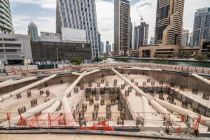
With more than 3 million workers and a GDP (gross domestic product) contribution of about £110 billion, the construction sector is vital to the Italian economy. Despite the challenges posed by the pandemic, the industry has shown growth and resilience. Italy’s construction industry is currently ranked sixth in the world, and evidence from recent years suggests that it is growing once again.
Italy is the 12th largest global building market outside of the United States, which has piqued the interest of American exporters. In Italy, American building products are reputable for their dependability and quality, even though they do not always satisfy the country’s strict visual design standards, which are important even for materials and components that end users do not frequently see.
Commercial projects in Italy are open to considering new or creative products and solutions since it sees itself as a worldwide leader on par with the US sector. The public sector, end users, and Italian firms are showing an increasing amount of interest in sustainability. High “green” performance product prospects exist in areas such as enhancing indoor air quality and conserving water and energy. The Green Building Council’s LEED principles, which originated in the United States, are gaining popularity in Italy and are being taken into account by many architects when creating new, energy-efficient structures. Increasing the energy efficiency of both public and private buildings is the aim of the European Green Deal.
Increasing the energy efficiency of both public and private buildings is the aim of the European Green Deal. A further element contributing to the need for more energy-efficient structures is the increase in Italian companies implementing ESG (Environmental, Social, and Governance) guidelines.
Table of Contents
7 Top Commercial Projects in Italy
Here is a list of the 7 top commercial projects in Italy worth taking notice of:
1. BNL-BNP Paribas Headquarters
Area: 75000 m²
Year: 2016
The architecture of this commercial project in Italy is set within a distinct and special environment. Due to the construction of the high-speed rail station, which creates a new function in terms of services as well as an “Urban place,” The context is unique in that it is a layering of infrastructures that are divided by two significant urban regions of Rome. In particular, the site of the new building’s intended placement suggests this Commercial Project in Italy should be designed by the “Janus” principle because of its topography, geometric shape, and relative orientation.
They think it’s critical that the new structure, which primarily consists of size and horizontality, engages in conversation with the nearby Tiburtina railway station complex. The conversation should make references to various viewpoints, station levels, and a different role (horizontal stratification) in the modern urban environment, without necessarily having to be direct.
Their objective is to satisfy the functional requirements with a commercial project in Italy that may, in its uniqueness and autonomy, blend in with the Tiburtina Station’s urban setting while also serving as a symbol for the people who use it and the city of Rome.
A plan for a building that can relate differently to the southeast with the Tiburtina Station complex and the northwest with the Pietralata district is derived from these considerations. dynamic, reflecting, and fading in places where the context is urban or “Slow,” facing north, where the perception is static, transparent, and material. In contrast, its perception is mostly dynamic and changes meter by meter (from the train, from the station, from the various parts of the city), almost as if it were moving.
As a result, the building takes on many roles that spark our curiosity about significant works by modern filmmakers and artists that address the topics of perception and “reflection” of reality.
2. Forti Holding Spa HQ and Office Building
Area: 4750 m²
Year: 2016
The new headquarters of Forti Holding S.p.a. are located halfway between Pisa and Livorno. Shops and the company group’s administrative headquarters are located there. This commercial project in Italy, which was created by ATIproject studio, is a well-rounded and noteworthy example of green architecture in the region. With a strong emphasis on bioclimatic planning and a commitment to environmental responsibility, the team has produced exceptionally high-energy performances. In actuality, the structure uses a lot of passive energy components, such as passive ventilation, thermal and shading technology, and careful daylighting.
Visitors are greeted by an expansive lobby with triple-height ceilings and ample natural light from the main road; the lobby is situated in the center of a ventilated facade. Conversely, the southeast facade is entirely made of glass. Because of this, a horizontal sunscreen system has been installed in front of the windows to filter sunlight and prevent overheating while still providing free views and sun protection.
Offering pleasant and open views of the surrounding countryside and mountains, structural and formal decisions have an impact on the inside working environment. Surfaces that are opaque or transparent have been examined based on their unique orientation. Relaxation spaces with views of the mountains are created by a roof garden and spacious outdoor terraces covered in natural materials. They also help to bring nature within the building, control the microclimate, and form the volumes. The entire south face of this commercial project in Italy is covered in solar panels, and it was sized and planned in conjunction with other green energy components to fully satisfy the building’s energy requirements.
It is noteworthy that this office building does not have any methane gas plants, which are typically utilized for heating in Italy. More than 80% of the energy needed for lighting and conditioning throughout the winter and summer is produced by photovoltaic systems. The coating of this commercial project in Italy is the first technological system in place because of unique design concepts. Concurrent with the development of the building smart shell, a state-of-the-art plant apparatus has been built that utilizes regenerative heat exchangers, geothermal air conditioning, and LED lighting systems.
By combining techniques and renewable resources, the goal is to reduce consumption, setting the standard for sustainable building in the Tuscan region with this headquarters. This commercial project in Italy is presently awaiting certification for sustainability with a LEED Gold rating.
3. Technogym Village
Area: 54000 m²
Year: 2012
The location of the Technogym Village, which is close to the Cesena exit of the A14 highway, is its primary advantage. Due to the building façade’s view of the highway, these facilities will have excellent visibility and serve as a point of reference for drivers; also, this will facilitate the company’s cars’ mobility. The wellness center, the R&D group’s labs, and other office buildings are gathered in “Technogym Village,” which has a view of the park.
The new office building (block B) will be constructed next to the production site to complement the functional units included in the largest Technogym project. It will extend linearly along the industrial building (block D) for 200 meters, distributed over four floors, for a total surface area of approximately 10,700 square meters.
Three stairs, a shaft with two independent elevators, and a panoramic staircase provide the vertical distribution. The main entrance is located in the park, next to the part that is most representative, and contains the auditorium and the presidency’s rooms. The building is enriched with a large curved lamellar wood roof and a continuous wood and glass façade that faces the park. The building’s structure is primarily simple and cost-effective, consisting of a combination of pre-fabricated steel and reinforced concrete elements.
The offices are arranged on two distinct sides of the building: the north side, which is more functional, overlooks the factory’s undulating roofing, while the south side, which faces the park, is protected from the sun by the curved roof. The amenities, common rooms for meetings, and open-space work areas are located in the center of the office building, while the individual, closed offices are located along the façades. In keeping with the idea of “Wellness,” this proposal emphasizes the use of high-performance natural materials (wood and glass) and the interaction between the inside of the building and the outdoors, which faces the park, through transparent interior partitions.
4. Office Building in Italy
Area: 2700 m²
Year: 2022
With just a year and a half to plan and construct, we took on a challenging job for their most recent office project in Italy. This unusual project entails remodeling a structure from the 1960s and adding a new addition to surround the old volume. To meet our agreed-upon sustainability goals, they decided to extend and utilize their previous office space rather than build a brand-new structure.
One of the project’s problems was integrating the two structures—the modern and the old—so that they formed a single, distinctive whole. To do this, the first stage was to define the exact geometry, which was based on the difference between the original building shape and the maximum volume permitted by the zoning regulations.
This commercial project in Italy began with the names of the employees in the building, followed by an analysis of their work patterns and an abstraction of a few concepts to develop a technique that may eventually become absolute and unbiased. They collaborated extensively with the client’s HR department right away to ascertain the workstreams and relationships among each employee. We notice right away that an office’s personnel has neutralized. August Sander’s “People of the Twentieth Century” are not like us at all. Everything is neutral, and practically all tasks may be completed in similar, neutral settings in an office.
They saw this as an opportunity to delve deeper and comprehend the individual’s requirements rather than the worker’s. To meet our needs as individuals—needs to interact, to isolate ourselves, and to find that variety that corporate positions frequently no longer provide—they set out to construct a workspace. They suggested using the 98-meter-long building as a gradient from the quietest to the most noisy tasks on the x-axis and from the slowest to the fastest movements on the y-axis to avoid explicitly identifying the regions inhabited by the various departments.
5. Segreen Business Park
Area: 31000 m²
Year: 2022
The idea behind this commercial project in Italy for new workstations is harmony between architecture and territory as well as between people and the environment. “The primary need was to develop a project inserted between two complexes, the old Microsoft headquarters, now in disuse, and the already existing Multi-tenant sector, called Segreen, to assist in the creation of a single Business Park” – says Paolo Pasquini, the founder of Studio Elementare The final backdrop for the entire sector is a new architectural design that is integrated into an existing context.
On the one hand, this results in a background of alternating volumes; on the other hand, the design of the landscape and the new services that are situated along the central route serve to connect the two compartments.
To ensure environmental well-being, Studio Elementare’s project called for demolishing the majority of the existing Microsoft headquarters and reconstructing it with a greater volume split into huge filtering and hanging green areas by LEED WEEL standards. The new functions are designed as a series of volumes with similar shapes and materials that are positioned logically to create a new, decreased proportion to the open spaces typical of a pedestrian metropolis. The new construction, which is smaller in scope than the pavilions mentioned above but whose structures of only one section have been preserved, entirely redone, and covered, adheres to the same principles.
The massive structure, which was intended to be a grand scenic endpoint for the pedestrian walkway, is divided into several volumes that are comparable to one another but vary in terms of height, cladding pitch, color, and placement. Despite being made up of several buildings, the property is distinct and its volumetric mass is significant: it consists of simple volumes with minor level variations as well as variations in the color and texture of the blind paneling for each building, with a lower volume in the middle that is distinguished on the façade by a hanging frame with a triangular pattern.
6. Salewa Headquarters
Area: 30595 m²
Year: 2011
One of the most well-known firms in Bolzano, Salewa Headquarters, has a remarkable setting next to the Bolzano highway that suggests a “Landscape” architecture in formal dialogue with the surrounding cliffs. This commercial project in Italy seeks to serve as a hub for engagement and communication between the company and its network of partners, clients, and suppliers in addition to housing new work spaces and an indoor climbing gym.
The new headquarters serves as a hub for various aspects of daily life, including work practices, leisure activities, and social and physical aspects. The Salewa headquarters is composed of several faceted slabs and towers, the tallest building in the city when it is completed being a 50-meter-tall edifice.
The proposal blends a big vertical glass covering with an electro-colored micro-perforated aluminum layer to shield the most exposed elements of the structure. The optical impact that results is similar to a rock crystal. The delicate protective layers and the thin pillars that resemble sheet metal interact to frame the façades and emphasize the difference between the visible and invisible spaces. This Commercial Project in Italy, which is geographically specific, serves as a hub for information sharing amongst the intricate web of material and immaterial relationships that make up a modern company’s daily operations.
7. TreeHugger Tourist Information Office
Area: 430 m²
Year: 2019
Situated near the Bishop’s Palace of Bressanone, just beyond the city’s historical center, this commercial project in Italy is the final installment in a sequence of “Architectural homicides” that span the 1800s to the 1970s. With their distinct traits of thin columns, deep loggias, and delicate overhangs, the site’s predecessor buildings—all devoted to greeting guests—have the airiness and levity that TreeHugger adopts.
To give the ground level to the city as a public space, this commercial project in Italy elevates its body on tiptoe. Not only are there new visual links established with the Bishop’s Palace main structure, but also with the Chinese and Japanese pavilions that round the Palace gardens’ corners. The building by MoDusArchitects, which becomes a new entrance for the city of Bressanone, reinterprets the unique, sinuous shapes of the corner pavilions.
An enormous tree that already stands there and controls the design defines the location. TreeHugger creates an unbreakable bond between the building and the natural world by circling the center platanus. The contrast between the scaly bark of the plane tree and the roughhewn walls of the bush-hammered concrete mimics each other’s tactile and visual characteristics.
Five arched spans, with the tree trunk serving as the pivot, raise the structure off the ground and follow the tree upward to create an open frame around the tree’s crown. The entire height of the walls was cast in one flow and then in subsequent portions to form a continuous 9-meter-high ring, within which the concrete plates were poured, creating the smooth, vertical surface of the outer concrete shell. The floor slabs and the curved walls work together to create a composition that unites the building façade, shape, and structure.
Conclusion
One of the most significant development areas in construction has been the commercial projects in Italy, which has seen a discernible increase in market share. This trend is expected to continue since the government has promised to make large expenditures on the country’s infrastructure in the next years.
Italy’s National Rail Research Program (NRRP) allots €32.1 billion for sustainable mobility, including money for finishing rail freight corridors and adding more regions to the high-speed rail network. By adding more bike lanes, metros, trams, and zero-emission buses, the plan seeks to improve ecologically friendly local transportation. This means constructing electric charging stations across the country in addition to hydrogen refueling stations for vehicles and trains.
Additionally, funds are allocated to “green” Italy’s ports. American companies may have chances if they have the products, services, and know-how to enhance logistics and transportation and make them more intelligent, sustainable, and sustainable.
Italy is to invest €9.2 billion to modernize and expand its ports between now and 2026. This investment is primarily meant for dredging, new breakwaters, and improved road and rail network links to increase the capacity of ships that Italy’s main container ports can handle. Initiatives based on digitalization will receive more support to improve port efficiency, sustainability, and security. The increased public funding in these areas might be beneficial to American companies with innovative ideas.
Suggested article for reading:
Top 7 Commercial Projects in Malaysia (2024)
7 Top Commercial Projects in Turkey
Top 7 Commercial Projects in Sweden
Resources:
BlackRidgeResearch | TechBeheMoths | ItalPregioSRL | ArchitectinItaly | Statista | Idealista | Archdaily
For all the pictures:


