One of the biggest and most significant sectors in Canada is construction. Along with building houses, buildings, schools, hospitals, factories, and retail malls, construction also entails a wide range of engineering projects, such as pipelines, dredging, petrochemical facilities, highways, and nuclear power plants. One of the biggest and most significant sectors in Canada is construction.
The majority of capital investments made by businesses, governments, individuals, and other industries are made by members of the construction industry. Because of this, the construction industry functions as both a production sector that provides the physical infrastructure needed for industrial expansion and housing, and a service sector where the majority of work is done in response to orders and investment decisions made by others.
The Second World War significantly increased construction activity in Canada after it had declined during the Great Depression. During this time, several British Commonwealth Air Training Plan airfields were built, as well as a rubber products plant in Sarnia, Ontario. The emergence of Canada’s contemporary construction sector was signaled by the speedy and efficient completion of projects during the war and the industry’s subsequent rapid growth.
Canada’s construction industry is an important sector that is essential to the growth and development of the nation’s economy. This industry, which is well-known for its versatility and tenacity, includes a wide range of tasks, such as building infrastructure and homes, commercial projects in Canada, and industries.
Table of Contents
11 Top Commercial Projects in Canada
Here is a list of the 11 top commercial projects in Canada worth learning about:
1. The Bow
Area: 199781 m²
Year: 2013
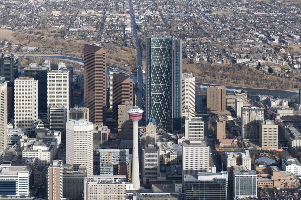
The tallest tower in Calgary, this commercial project in Canada, officially opened This week, Calgary has hosted special activities to commemorate the formal opening of The Bow, a 237-meter-tall headquarters tower that is both the tallest structure in the city and the tallest tower in Canada outside of Toronto. The project, a striking new landmark on the skyline, is equally significant from an urban, social, and environmental perspective. The public base of the tower is lined with stores, eateries, and cafes and opens up into a spacious plaza with landscaping, while three six-story sky gardens punctuate the office floors, encouraging natural ventilation and lowering energy consumption significantly.
This commercial project in Canada, which houses a dual headquarters for Encana and Cenovus, is the first significant development on the east side of Centre Street, a key thoroughfare through downtown Calgary. The building’s design was influenced by organizational and climatic analyses. The tower maximizes the perimeter for cellular workplaces with views of the Rocky Mountains while facing south and bending towards the sun to take advantage of lighting and heat. The structural loading is minimized by orienting the convex facade toward the prevailing wind, which lowers the amount of steel needed for the naturally effective diagrid system. The structure’s six-story triangular sections serve to visually deconstruct the building’s scale.
The glazed facade is drawn forward to form a sequence of atria that run the entire height of the tower when this commercial project in Canada turns inward. By serving as climate buffer zones, these areas insulate the structure and greatly lower energy usage. Given that each floor plate is designed to house an entire business unit, it was necessary to foster intercompany cooperation and add a social element to the office environments. As a result, three magnificent sky gardens—which include mature trees, seating, meeting rooms, catering facilities, and local lift cores—that extend into the atria at levels 24, 42, and 54 provide vertical access to the office floors.
2. The Edge Office Building
Area: 5250 m²
Year: 2019
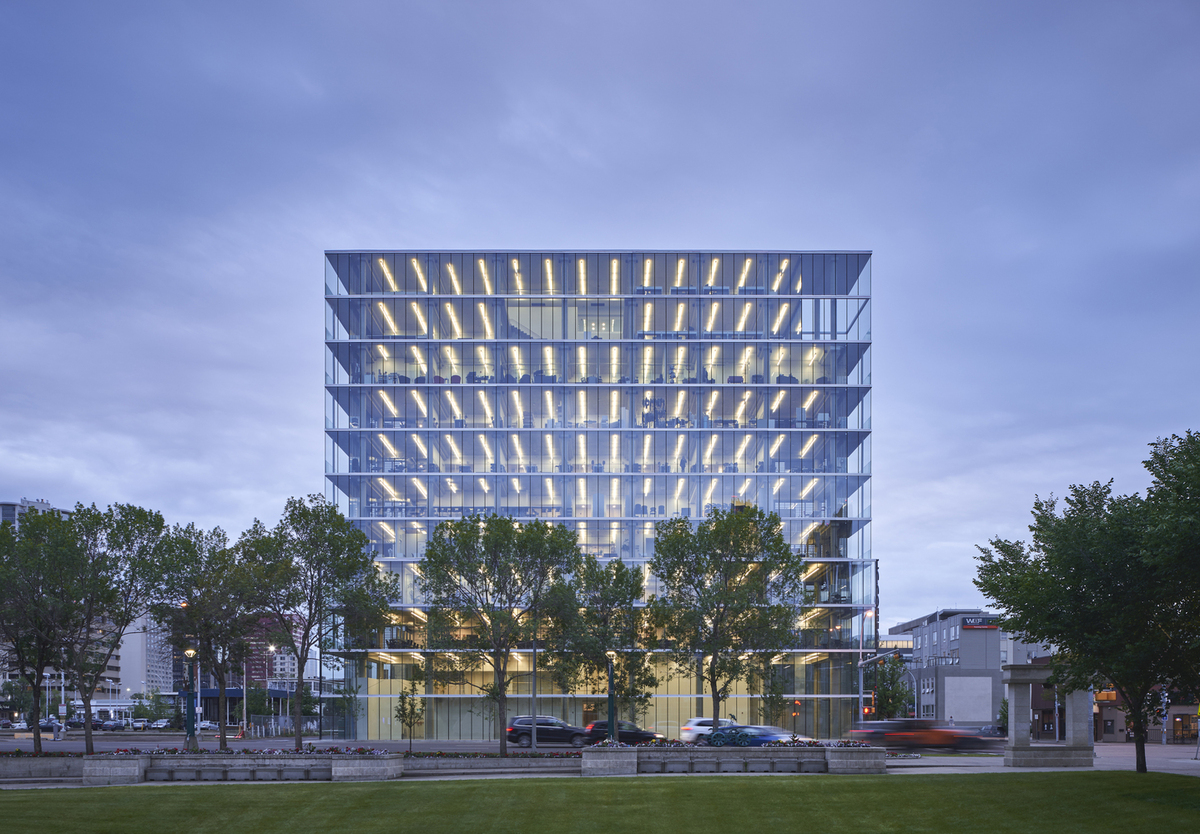
Located on a solitary 15-meter-wide plot, this commercial project in Canada is a 10-story office skyscraper that boasts one of the biggest solar walls in Canada. Seventy-eight percent of the building’s electrical needs are met by its 560 solar panels. Due to its connection to the city’s electrical system, this commercial project in Canada can return extra power on sunny days. Both insulated triple-glazed and quadruple-glazed systems are included in the design. Comfy north daylight falls naturally on the open floor plates. During the summer, the building uses little artificial light and the north windows don’t need blinds. Large thermally isolated balconies and solar screens to regulate sunlight are located at the ends of the structure.
This commercial project in Canada has private office space on the upper two levels and private educational facilities spread across seven floors. Through varying pop-up applications in the open lobby, the ground floor interacts with the street. There is no need for a disruptive ramp at ground level because the condominium unit parkade next door provides access to eighteen underground parking spaces.
The solar wall is a prototype for comparable infill situations and offers long-term advantages. Here, the structure to the south is an adjacent warehouse that was recently repurposed (by Dub Architects as well), with no plans for development for 50 years. However, the prototype is quite viable in such areas because the solar wall has a payback period of only 5-8 years. 26 tonnes of CO2 will not enter the atmosphere each year thanks to the solar wall.
3. 1133 Yonge Street Offices
Area: 65000 ft²
Year: 2019
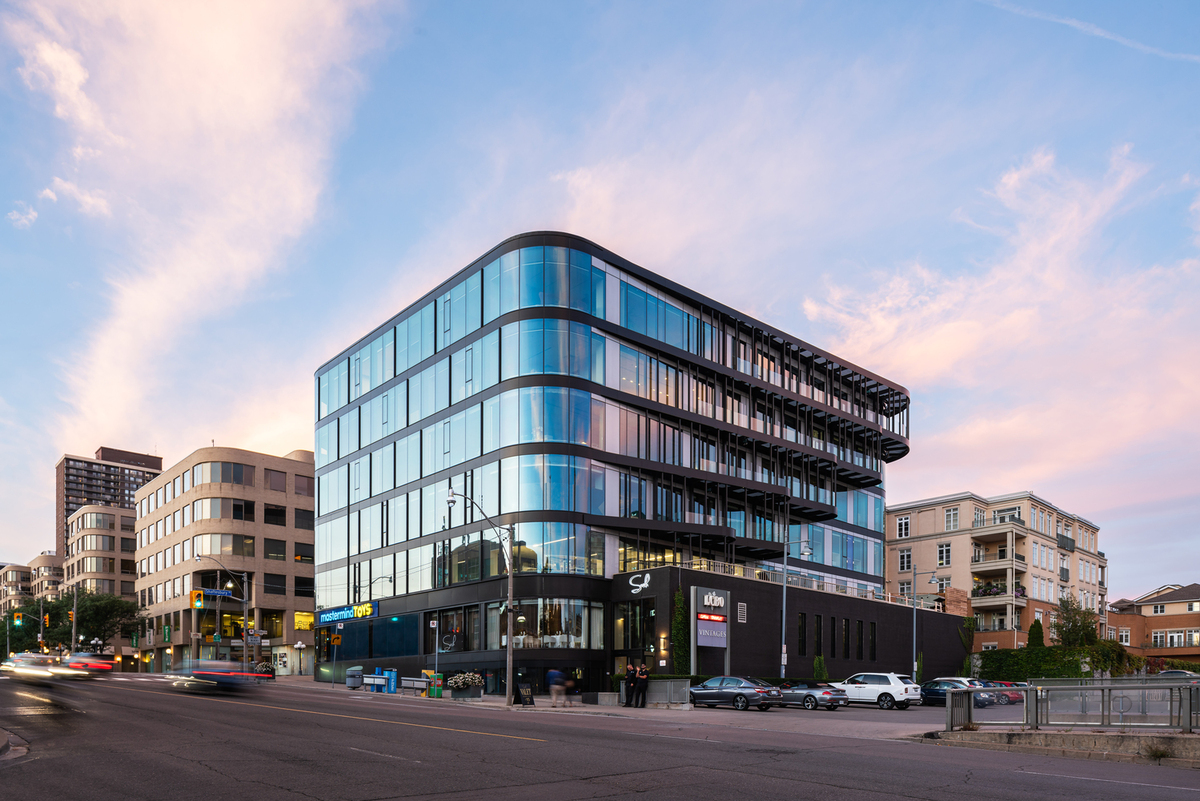
This commercial project in Canada has had a significant makeover by Studio JCI, which fully modernized the mid-rise, mixed-use structure constructed in the 1980s, improved the building’s energy efficiency, and increased its amenities and accessibility for residents. This project is a reflection of a global trend in the design and construction sector that favors renovating existing buildings rather than constructing new ones to cut waste and carbon emissions. This commercial project in Canada gave us a real opportunity to explore the concept of ’embodied energy’ and the environmental benefits of reusing an existing building rather than demolishing and rebuilding it.
Many of the building’s original elements, such as its concrete structure and distinctive rounded corners, have been retained by JCI, and it is located next to the city’s historic North Toronto Railway Station. They added a high-efficiency curtain wall to the building’s facade, highlighting its gracefully curved shape and providing expansive inside views of the city. Cantilevered steel balconies increase passive cooling and amenity space while enhancing the building’s southern façade with charm and intricacy. According to Studio JCI Principal Jaegap Chung, “1133 Yonge Street is a prominent location in downtown Toronto, so they wanted to better connect the building with the streetscape and passing pedestrians.” A new Yonge Street public lobby is part of the project.
Additionally, Timbercreek Investment hired Studio JCI to develop The Exchange, an avant-garde co-working space situated on the third floor of 1133 Yonge Street. This area illustrates the worldwide trend toward more informal, open-concept work settings in office design. Members who rent office spaces at The Exchange have access to a big open kitchen and lounge area, with options ranging from private executive offices to shared community desks.
These are created with simple lines and a muted color scheme, as is the spacious boardroom. In the kitchen and reception spaces, delicate glass components counterbalance hefty stone elements. Broad southern views of the downtown skyline are available from the lounge, which also has a whimsical, vast lighting display made of hand-blown glass spheres in a range of colors.
4. Bay Adelaide Centre
Area: 111000 m²
Year: 2010
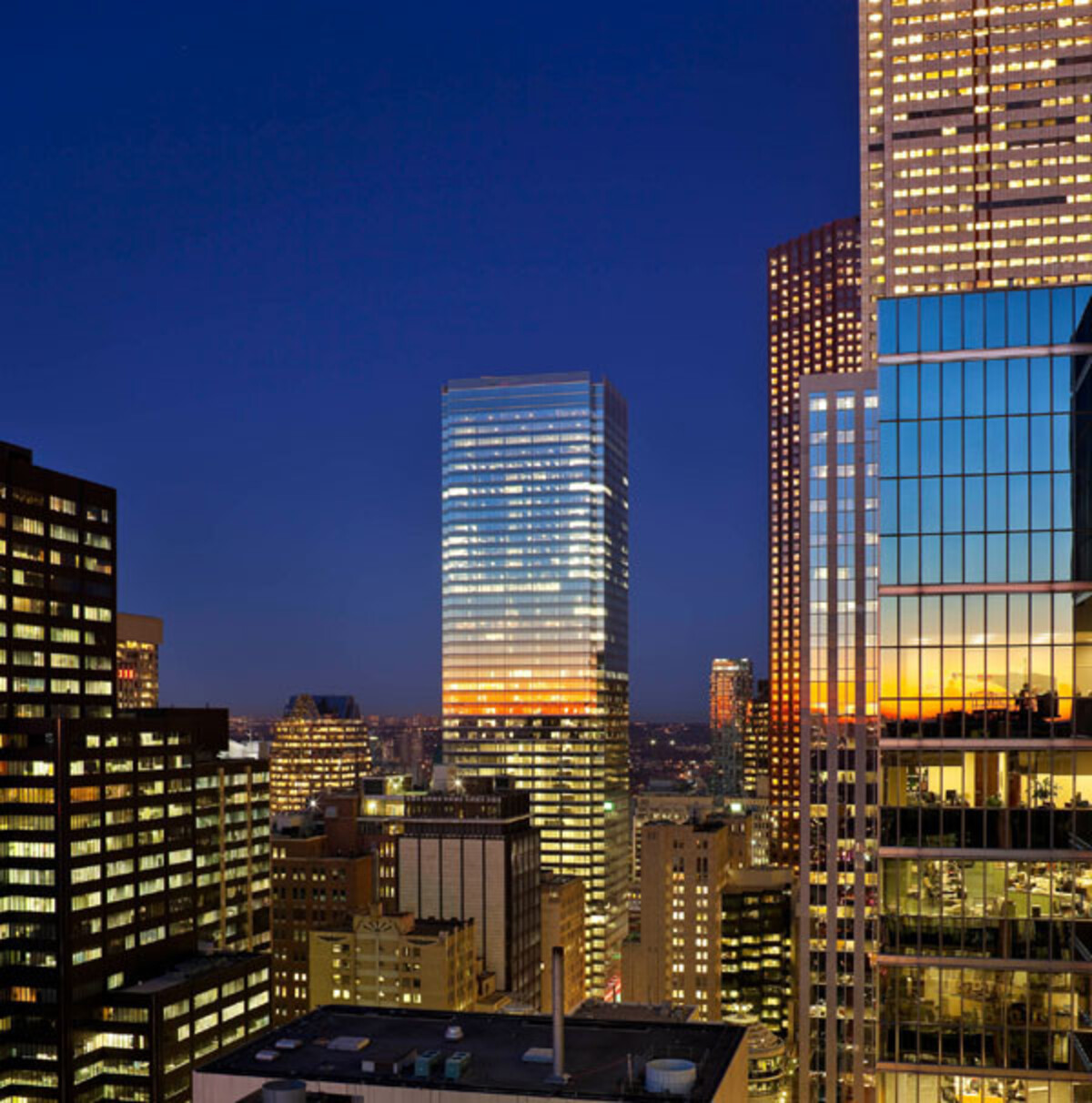
The 51-story commercial project in Canada finished in January 2010, is situated in the financial district of Toronto on the western border of a construction site that spans two city blocks and is comparable in scale to the nearby bank skyscrapers. Around 3,700 m² of below-grade retail space connected to the downtown PATH system and over 111,000 m² of rentable class-AAA office space are both included in the project. With an urban plaza in its center, the new tower is the first part of a complex consisting of three towers. The urban plaza, spanning about ½ acres and built during the project’s initial phase, offers a public space appropriate for both everyday use and special occasions.
This commercial project in Canada, which is situated on Bay Roadway, is set back from the road to honor the datum formed by the ancient building cornice lines that form the “Bay Street Canyon” along the roadway. The 1926 National Building’s reconstructed exterior, created by Chapman and Oxley, contributes to the canyon and is artfully incorporated into the new tower’s design.
The very transparent main building lobby, with walls covered in Makore wood and classic Statuario marble, fascinates pedestrians at the crossroads of Adelaide and Bay Streets. The lobby’s lighting transforms it into a “Beacon” at night on the intersection of Adelaide and Bay Streets. James Turrell, a prominent public artist, has a large-scale installation facing Adelaide Street. The “Missing link” in the city’s underground walkway system connects Union Station and Eaton Centre with a retail concourse located below grade. The office lobby’s escalators and the plaza’s distinctive glass walkway provide light and direction into the path below.
The concept is a modernist structure that honors and draws inspiration from the unique architectural style of Toronto’s Financial Core. This commercial project in Canada, more transparent than any other in the downtown area, is a perfect glass prism covered in spandrel panels with ceramic frit and clear viewing glass. Four-sided structural silicone within a channel surround supports the glazing, giving the building skin a feeling of lightness and delicacy.
5. Absolute Towers
Architects: MAD Architects
Year: 2012
Skyscrapers have represented scientific prowess, premier capitals, and societal projections of riches and prosperity throughout the urbanization process. In corporate areas around the world, this constrained framework for skyscrapers frequently leads to solutions constrained by homogenous, linear architecture and degenerative duplication. Unrestrained by efficiency-driven development tactics, metropolitan life is badly impacted, forcing people into an unnatural condition of conformity. Our cities will never have the cohesiveness of life that the word “Forest” suggests unless there is a challenge to the current quo. A forest is a healthy ecosystem in which all organisms depend on one another for survival.
What does our cities’ future hold? How should the notion of developing high-density cities be understood? How can city people enjoy the enriching power of nature when that presence is gradually dwindling due to the ever-increasing deluge of concrete? To support a harmonious civilization, future high-rise structures must stimulate an increased degree of complexity in our cities in response to these issues.
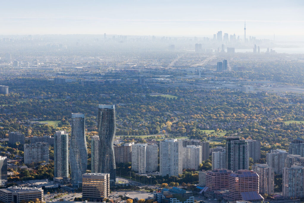
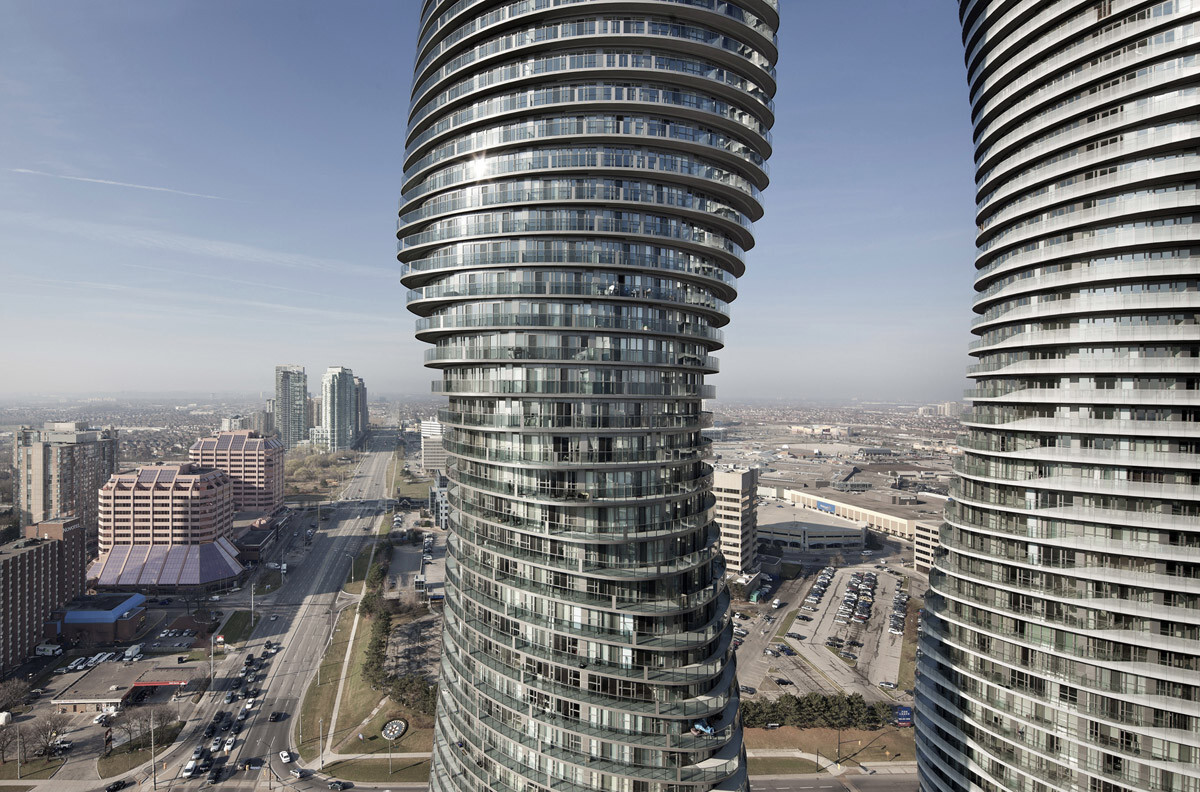
This commercial project in Canada, affectionately called the Marylyn Monroe Towers by the locals, is oriented in line with the natural lines or wavy flow of life. This flow-activation creates an organic landscape punctuation and a yearning for an urban appreciation of passion. Here, we flourish in defying the maintenance of ordinary, boxy skyscrapers. Our goal was to offer every inhabitant a distinct and heterogeneous urban experience. At the micro-scale of a single level, continuous balconies foster community and increase individual viewing angles.
6. Le 1650
Area: 3700 m²
Year: 2015
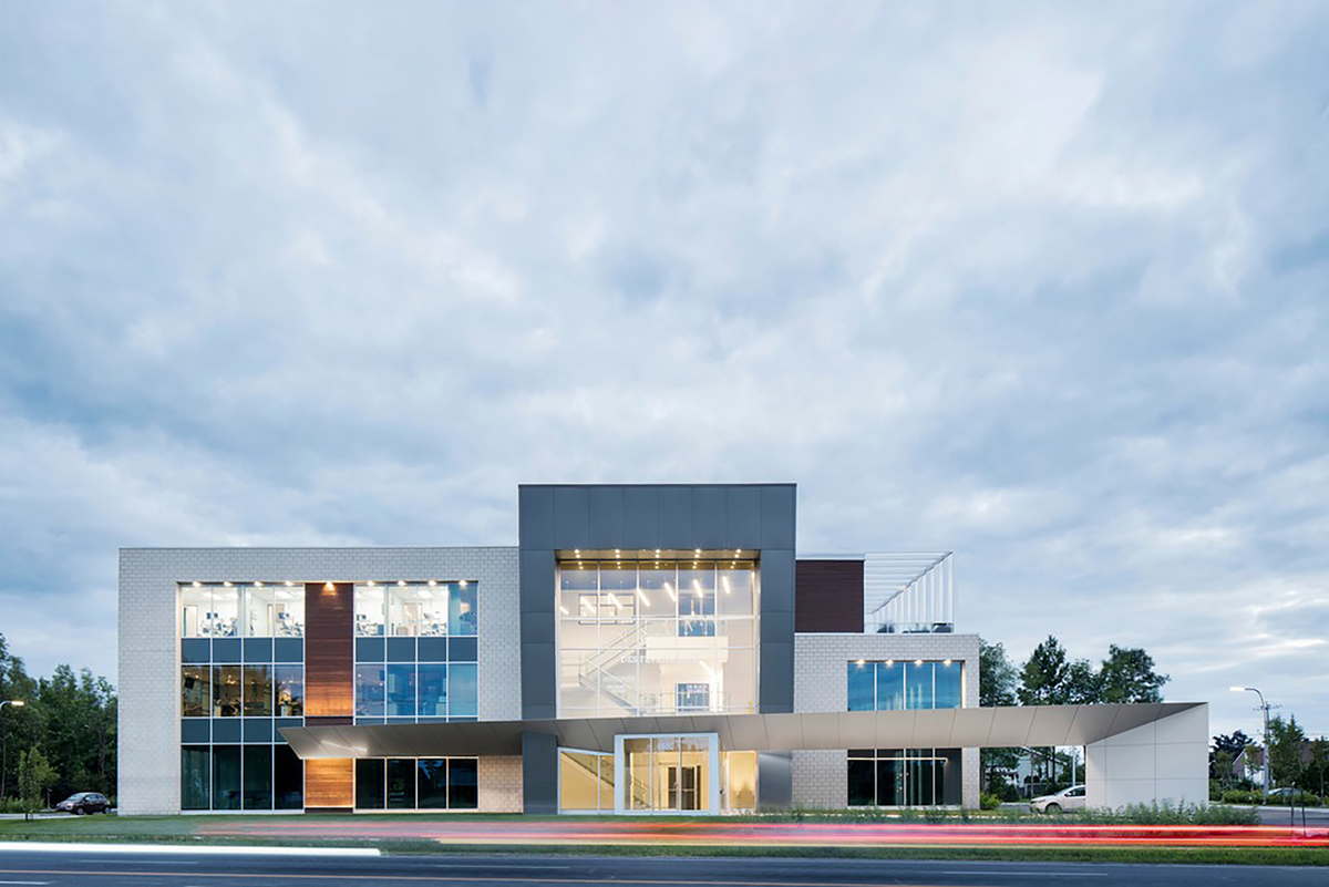
In addition to supervising this commercial project in Canada’s actual construction, the multidisciplinary firm A2DESIGN created the blueprints for the complete structure. Le 1650 comprises a main level that is for lease, while the first and second levels are co-owners Drs. Daniel Godin, an orthodontist, and Alain St-Onge, a dentist,’s clinics. The centerpiece of this brand-new building is a spacious rooftop deck that sits next to a training-purpose conference room.
The goal was to design and construct a cutting-edge facility that would stand out from the competition thanks to its bold, distinctive style and sharp angles, all the while keeping a sober, basic appearance that would allow it to blend in better with its surroundings. The building bulk and the protective aluminum roof that links the main entrance to the parking area are distinctive features. Ample natural light streams into the basic, aesthetically pleasing interiors with neutral tones thanks to the expansive windows.
Gestion immobilière 1650 is concerned about the environment. Because of this ethical approach, A2DESIGN was able to propose environmentally responsible solutions, such as the use of noble and sustainable materials that are primarily sourced locally. Additionally, an Earth-Energy System (EES), a geothermic system of ground-source heat pumps, has been erected.
This commercial project in Canada is extremely energy-efficient because of this network, which consists of 24 wells drilled to a depth of 150 meters, which pulls heat up from the earth in the winter and reroutes it in the summer. One kilowatt of electricity generates three to four kilowatts of heat. To save energy and prolong fixture life, all lighting fixtures are LED.
7. Churchill Meadows Community Center and Sports Park
Area: 75000 ft²
Year: 2021
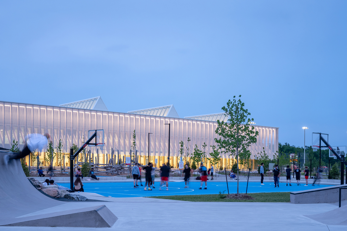
This commercial project in Canada is located in a Mississauga, Canada, suburban community west of Toronto, in an area that is expanding quickly. A 50-acre agricultural area is transformed into a beautifully textured parkland, with a 75,000-square-foot community center serving as the focal point. The park is a new destination in the network since it connects to an already-existing multi-use trail system.
The community center is a neighborhood icon for social meetings and healthy activities, as shown by its dynamic yet modest form. The dramatic canopy that envelops the gym, lobby, and pool expands and reveals the building’s Mass Timber structure, which is composed of a variety of glulam columns that serve as curtainwall and structural framing.
Expanded aluminum mesh covering this structure shields the wood from the weather. This screen reduces solar heat gain by filtering sunlight in a manner akin to a tree canopy. It is an essential part of the overall design and daylighting control approach. In addition to providing residents with a clear view of the park, it passively lowers this commercial project in Canada’s total mechanical energy loads and energy usage.
This section of the community center divides the interior spaces into two bars that run the length of the building: the triple gymnasium and aquatics hall with lap and leisure pools are located on the west bar, which is wider than the east bar, which also houses changerooms, a teaching kitchen, and multipurpose and fitness rooms on the floor above.
8. MEC Vancouver
Area: 5713 m²
Year: 2020
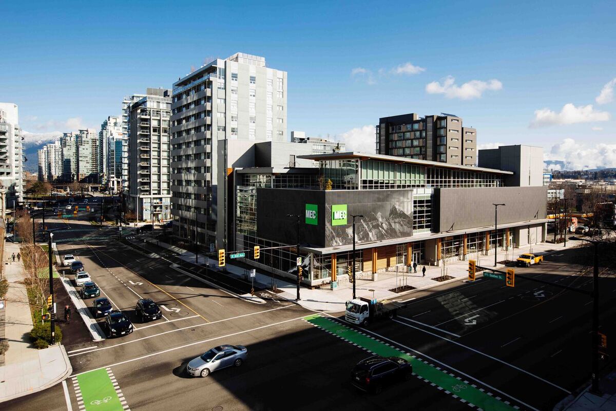
This commercial project in Canada is a progressive office and retail complex located at the entrance to Vancouver’s Olympic Village district. With sustainability as a top priority, the project’s design skillfully incorporated green elements. The three-story mass timber structure has three stories of below-grade concrete parking below two levels of retail space and one level of offices. This commercial project in Canada’s generous use of glass facing the street and its cedar wood soffit/column canopy, which stretches the whole length of 2nd Avenue, encourages community involvement. Its interior places a high priority on user well-being thanks to abundant natural light, a tall floor-to-ceiling plate, and wide-ranging exterior vistas.
High levels of insulation and airtightness (R50 and R40 for the walls and roof, respectively) as well as strategic air handling via radiant heating and cooling are examples of high-performance characteristics. A highly efficient power plant is connected to a hot water loop system via a district heating network (NEU). By selling energy to the system, the building rejects heat to the district heating network (the first for buildings that use the NEU). Six tons of CO2 are avoided annually as a result of these variables.
The structure also collects rainfall, which is then used in the greywater system using a blue roof. Strict regional regulations are followed for treating a 15,000 L subterranean rainwater cistern for use in restrooms, resulting in an annual reuse volume of 500,000 L. When low-use fixtures are included, the annual potable water use per inhabitant is 2,536 L, which is a 46.6% decrease from the LEED reference.
The False Creek Flats’ native vegetation, which includes native grasses and climbing vines, and industrial elements like Corten steel and recycled granite cobbles are employed in MEC Vancouver’s landscape design, which pays homage to the region’s past. Water from two green roofs flows into a bioswale and water feature after flowing down a slope Corten steel water feature. Drought-tolerant plants produce a habitat that is beneficial to birds and bees in the corten steel planters that span the length of the building along Quebec Street and the laneway.
9. SmartMill Head Office
Area: 2000 m²
Year: 2022
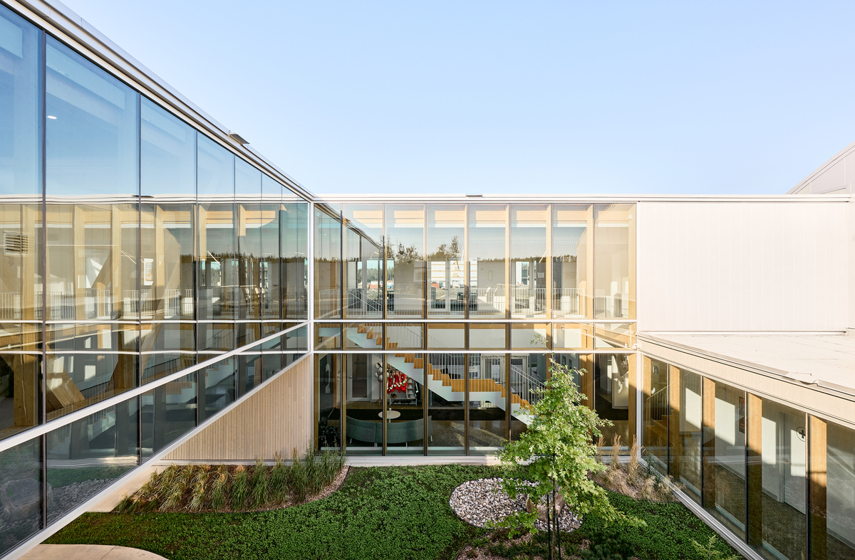
The 2020 head office and factory of Smartmill, a firm that develops automated technology for the wood processing industry, were built by Atelier Guy Architects. This commercial project in Canada’s primary goal was to construct a structure using exclusively lumber, in keeping with the company’s mission, and to provide areas that were not only practical but also cozy, airy, and welcoming. The company’s goal is demonstrated at several project levels by the tangible integration of local timber and goods into the new head office.
The company needed a new facility that would accommodate its expanding needs, and it needed to be about 2,000 square meters in surface area. The structure is split among an administrative pavilion facing the street and an industrial component that opens into the rear, serving as a showcase for innovation. This commercial project in Canada is oriented around an expansive, well-lit outdoor courtyard that is teeming with vegetation, providing abundant natural light to the surrounding areas.
The administrative area has a lot of windows that let in natural light and a direct view of the center courtyard outside. Furthermore, the open areas for circulation that run the length of the translucent walls encircling the courtyard highlight the harmonious integration of the inside and outside.
Access to the upper-floor workstations is provided via the architectural staircase, which spans two floors and is adorned with the company’s vivid color scheme. Overlooking the courtyard, an open office and a sitting area are illuminated by natural light. The perimeter of the floor layout is occupied by closed management offices, conference rooms, support, sanitary, and technical spaces.
The transparent and lightweight structure of the administrative section, which extends from the entrance to the inner courtyard, sets it apart. The structure, which is made up of three sizable triangular sections of glued-laminated timber parts, allows for a span without columns, which greatly increases arrangement freedom. Noticeable from the street, this structural design discreetly references the company emblem while adding to the project’s architectural identity.
10. UBC Bookstore
Area: 79650 ft²
Year: 2014
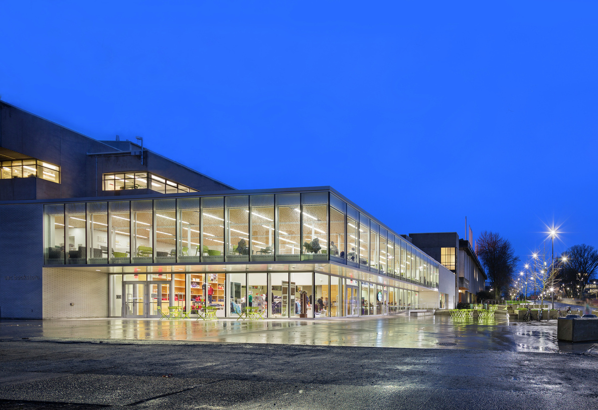
On the main campus of the University of British Columbia (UBC), the recently enlarged and remodeled bookstore serves as evidence that small design changes may have a big impact. Beyond these initial improvements to the store’s appearance and offerings, this commercial project in Canada was transformed into a bustling hub that enhances the surrounding area and the store itself while also promoting the overall well-being of UBC students. The design team started by expanding the store’s perimeter outside and covering the crumbling concrete facade with a high-performance glass skin. This transformed the bookstore’s imposing structure into a bright glass box that enhances the shopping experience and increases campus safety by establishing visual links with the nearby streets and courtyard.
The architects were able to unravel the previously muddled plan and reveal the reflective interiors with the help of this box. The expansion has a new convenience store, a coffee shop, an ideal retail space for UBC items, and several flexible spaces that promote socializing and casual conversation. The convenience store and coffee shop open up into a recently designed courtyard, energizing the campus’s boundaries even further. There’s a glass mezzanine above the coffee shop and a new retail area where students may hang out, study alone, have spontaneous conversations, or plan informal gatherings. Because of its elevated location, there are more people on the street and more opportunities to observe individuals.
To bring in natural light from the glass box, the design team decided to create a wide set of steps leading down to the basement. The poured concrete steps, which have built-in wood seating, serve as a comfortable gathering place for lectures and concerts as well as a friendly invitation for students to explore the shopping districts beyond.
11. STGM Head Office
Area: 1000 m²
Year: 2014
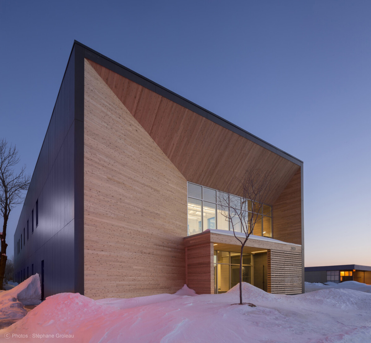
The new headquarters of STGM is situated next to the eco-neighborhood of Estimauville in Quebec City’s Beauport municipality. It is a two-story, 1,000-square-meter commercial project in Canada that emphasizes innovative, environmentally friendly architecture. With careful integration of a longitudinal form, orientation to the sun, light wood frame, carefully chosen materials, and effective systems, the building manages to create a low ecological footprint while providing an extraordinary level of comfort for its residents.
With attention to the interaction between solids and voids, high-performance concrete siding and Eastern Cedar combine to produce an impression that is both simple and dynamic, giving the building an air of elegance that defies time and fashion. From the beginning, the designers aimed to achieve a high standard of sustainability, a concept that was already central to the company’s goals. They did this by applying ingenuity to put into practice the tactics required to achieve LEED-NC Platinum status. Coherence, comfort, and simplicity were chosen as the foundational ideas with this goal in mind.
The two large open-area workshops, closed offices, conference rooms, and indoor and outdoor gathering and relaxation spaces make up STGM’s new headquarters. The north-south developed longitudinal form is sober and modern. The building combines creativity with a variety of environmentally friendly elements to receive the highest accreditation for sustainable building.
Conclusion
The construction sector is essential to the Canadian economy because it builds both non-building infrastructure to support a functioning economy and private and commercial structures to suit the needs of a rising population. For instance, 252 sizable infrastructure projects worth a total of $33.85 million were being developed in Canada.
Commercial projects in Canada are a significant business segment that includes institutional structures as well as retail establishments, schools, hospitals, and sports arenas. Most commercial building constructions, including retail establishments, are contracted out to private businesses. On the other hand, institutional structures like hospitals and schools are funded and managed by the national or local government.
Approximately 19 million square feet of commercial projects in Canada in 2021. An estimated $36.5 billion in revenue was generated by the commercial and institutional building industry in 2022. This is a sector that is expanding, with average annual growth of 3.9% from 2017 to 2022.
The building and construction sector is essential to Canada’s infrastructure development and upkeep as well as the country’s economic expansion. It is also one of the major employment sectors in Canada, with both new hires and current employees having high job prospects.
Suggested article for reading:
Top 7 Commercial Projects in Malaysia (2024)
7 Top Commercial Projects in Turkey
Top 7 Commercial Projects in Sweden
Resources:
Archdaily | PetitFute | ArchEyes | TheCanadianEncyclopedia | ROAC | Madeinca | Dezeen | Architizer
For all the pictures: Archdaily

